
Navigation is an essential facet of a good WordPress website with great design. As such, it’s worth taking some time to think about how visitors to your site interact with your pages through your navigation. One way you can do this is by using a sticky header.
This is where the header section of your site keeps to the top of the screen as the user scrolls. This provides myriad benefits, but one of the primary plus points is that your navigational elements stay within the user’s eyesight, regardless of where they are on the page. For this reason alone, a sticky header is a welcome user interface (UI) element.
In this tutorial, we’re going to show you how to create a sticky header within WordPress. It’s going to cover lots of aspects, such as examples across the web, WordPress plugins that can help you, and a guide on how to develop your own sticky header. First, though, let’s discuss what a sticky header is in more detail.
What a Sticky Header Is

The header portion of your site is kind of like the information desk of your site. It’s going to be something most users will spot first, and it will always be somewhere they will check to find out a few key pieces of information, and perform certain actions:
- For instance, your logo or site name will be here, which serves as a grounding point for your users. They will be able to get back to the homepage by clicking the logo in most cases.
- If you run user accounts on your site, the header will usually offer a link to log into those account and profile pages.
- There may be search functionality here, especially if you have a large site with lots of content in different areas.
- Of course, your site’s navigation is also an integral part of the header.
On the whole, your header is a touchpoint for users. You’ll find that it’s often the ‘bar’ for F-shaped reading patterns, so it commands attention from your users on an intuitive level.
You’ll likely already know what a sticky header is, even in an intuitive sense. It’s where your site’s header section ‘sticks’ to the top of the screen as you scroll along. In contrast to a static header, which stays in place and disappears as you scroll, the sticky header is an always visible element.
While the typical approach for a sticky header is to tack a static version of it to the top of your screen, there are a few different ways to make this more usable, screen-efficient, and dynamic. Next, we’ll take a look at some real-world examples.
Examples of Sticky Headers On the Web
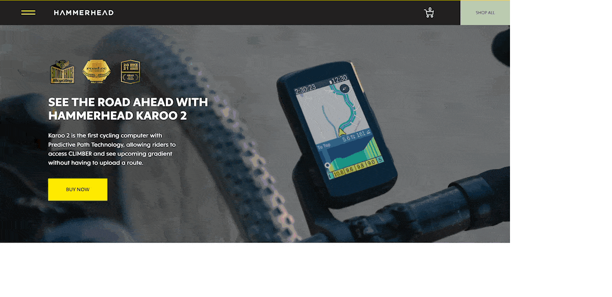
You’ll find sticky headers all across the web, and it’s a good idea to check a few out to see the scope of what you can achieve. One of the most basic examples around is from Hammerhead. This site uses a ‘flyout menu’ and a sticky header, and it’s straightforward: It’s committed to sticking to the top of the page in its static layout:
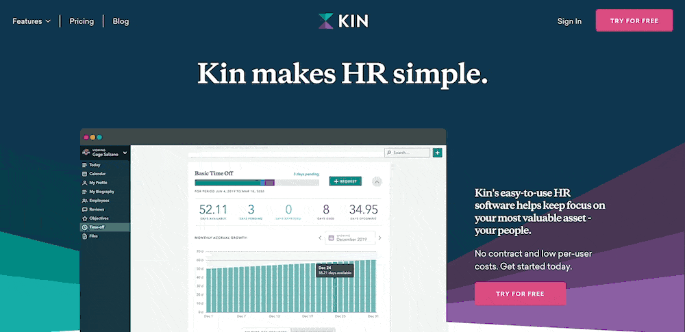
Another simple implementation is from Kin. This uses a typical sticky header, but this time with a few cool design elements.
You’ll notice that the contrast changes based on the part of the website you scroll through, and there are some nice transition effects too:
We can’t end this section without mentioning the Kinsta sticky header. This also keeps things simple with regards to the elements of the header, but includes a neat usability touch that offers value to the visitor:

This time, you’ll see the header disappear when you scroll down the page. However, it will reappear when you scroll back up – you can refer to it as a ‘partially persistent header.’
The premise here is that scrolling down means you are investing your time in the page itself, so will likely not need navigation, login pages, or to head elsewhere. However, at the point you scroll up, you are more likely to want to head to another page on the site. Here, the sticky header will show up to save the day.
It’s these little user experience (UX) touches that make for a site visitors will want to come back to. For your own sticky header designs, you’ll want to consider what you can do to make a UX and UI that focuses on the visitor’s needs.
Why You Should Use a Sticky Header For Your Site
Lots of sites use sticky headers, and there are plenty of good reasons why this is the case. They can be crucial parts of your overall site experience and have a lot of influence over your UX and UI.
Given that the elements you’ll include in a header are those the user will always want to access, it makes sense to always have them on display. This is especially true for smaller-screen devices and formats.
While it might seem counterintuitive to have an ‘always-on’ header when viewport space is at a premium, this is merely a small sacrifice. The real benefit is to give a mobile user less reason to scroll around – a necessity on smaller devices. If you can provide your site’s navigation without the need for scrolling, the user can move around your site with greater ease.
The Pros and Cons of Sticky Headers
We cover a few of the plus points for sticky headers, so let’s summarize them quickly:
- You can offer navigation that the user can always access, which helps to preserve the natural reading pattern on your site.
- You’re able to adapt the header to different needs, such as contrasts, color schemes, or even user intent.
- There’s the opportunity to offer value to the user, for both desktop and smaller screens.
However, a sticky header is not a panacea for increased UX, and there are a few downsides to using them:
- We cover this in brief, but for screens of all sizes, you’ll need to allocate space for your header.
- A sticky header will naturally take away from the rest of your content because its own elements will draw the eye away from the page body.
- There’s more development work that goes into a good sticky header because you need to implement it, make sure it works within different browsers, and check it for bugs on smaller screens.
However, if you think about your design choices, user needs, and site goals, you can mitigate or remove all of these drawbacks, while you keep the good points. One way you can do this is through WordPress plugins.
3 Plugins To Help You Create Sticky Headers
Over the next few sections, we’ll showcase some of the leading sticky header plugins for WordPress. Later, we’ll talk about whether this type of solution is right for you. Regardless, a plugin can help you implement functionality without the need for code, which is valuable if your theme doesn’t include it.
What’s more, you can leverage the design and development experience of an expert through the plugin. The developers will make some of the more important technical choices for you, and wrap it up in a UI that’s intuitive and easy to use.
1. Sticky Menu & Sticky Header
Webfactory’s Sticky Menu & Sticky Header plugin is a good first choice, due to its wealth of features, helpful flexibility, and budget-friendly price.
The draw here is that you can make any element on your site stick to the screen. This might be helpful in a number of ways, but it means that implementing a sticky header is a doddle.
The plugin also comes with an array of powerful options to help you implement a sticky header:
- You get to set your desired level of ‘top’ positioning. This means you can add space to the area above the header to fit your design goals.
- There are also other positioning options, such as using the z-index CSS property to design your site ‘front-to-back.’
- You can enable the sticky header only on the pages you select, which might come in useful if you have landing pages or other unsuitable content.
Sticky Menu & Sticky Header also includes a debug mode, to help you fix any ‘non-adhesive’ elements. The Dynamic Mode will also help to address issues with responsive designs.
The best news is that Sticky Menu & Sticky Header is free to download and use. What’s more, there’s a premium version that takes away more of the technical know-how you need.
With the free version of the plugin, you’ll need to know the element’s selector in order to specify it in the options. However, the premium version ($49–199 per year) offers a visual element selector to bypass this.
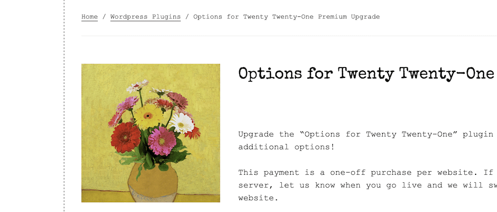
2. Options for Twenty Twenty-One
While we wouldn’t recommend a WordPress default theme for most customer-focusing sites, they do have enough in the bag for blogs and similar types of sites.
Twenty Twenty-One is one of the standout default themes in our opinion but lacks sticky header functionality. If you want to add this feature, the Options for Twenty Twenty-One plugin could achieve what you need.
This edition of the plugin is one of many. Each recent default theme has a version, but there isn’t yet one for Twenty Twenty-Two. Regardless, the core functionality of the plugin provides a lot of extras:
- There’s a Full Site Editing (FSE) tool, ready for its complete rollout.
- You’re able to change the font size for the body, remove hyperlink underlines, and other simple customizations.
- You can work with the maximum widths of containers and elements, without the need for code.
There are lots of other options for your navigation, content, footer, and header. For the latter, you can hide it from view, make it full width, add a background image and color, and plenty of other alterations.
While the core plugin is free, you need a premium upgrade ($25–50) to access the sticky header options. This lets you adjust the settings for both mobile and desktop headers from the WordPress Customizer:
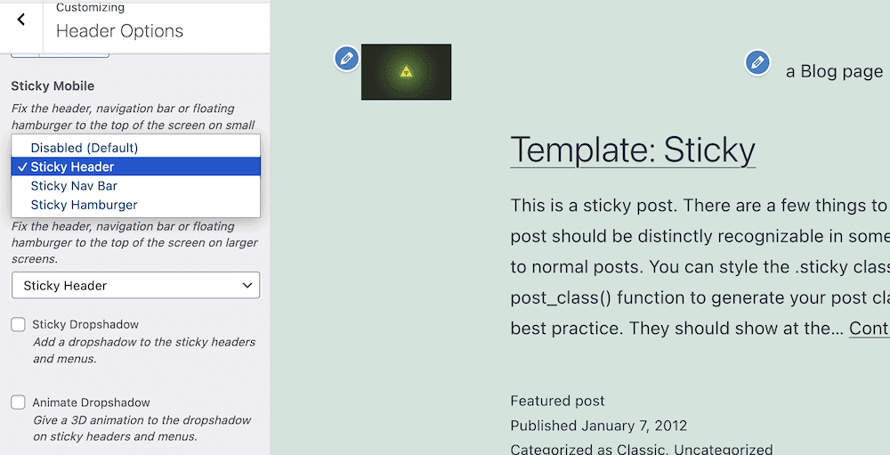
Given the name, you shouldn’t expect this plugin to work with any other theme than Twenty Twenty-One (or whatever ‘flavor’ you choose.) However, if you do use this default theme and don’t want to code, it will be ideal to help you add a sticky header to your site.
3. Floating Notification Bar, Sticky Menu on Scroll, and Sticky Header for Any Theme – myStickymenu
Here’s a plugin that lays its cards out on the table. Premio’s myStickymenu plugin offers almost everything you’ll want to include in your own sticky header, and packs in a great amount of functionality.
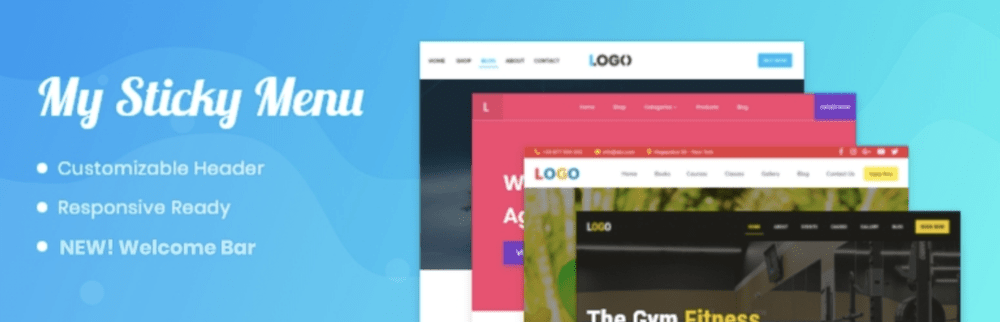
It has an astounding number of positive reviews on the WordPress Plugin Directory – 799 five-star reviews for an average of 4.9. Part of this is down to the comprehensive feature set at your disposal:
- It offers usage flexibility. For example, you can create a welcome bar as well as a sticky menu, and header.
- The plugin adapts to how responsive your site is. This means you won’t need to implement any more functionality using code.
- In fact, the plugin doesn’t need you to know how to code in order to use it to the full.
- The myStickymenu plugin has compatibility with a number of leading page builder plugins, such as Elementor, Beaver Builder, the native Block Editor, the Divi Builder, and many more.
You also have a number of customization options to make your sticky header work how you’d like. For example, you can choose to make a partially persistent header, change simple aspects such as background colors, typography choices, and more.
Also, because of the different ways you can present your sticky header (such as the menu and welcome bar options), you can choose how they display, and where, on your site.
Even though the free version of myStickymenu could be enough for your needs, there’s also a premium version ($25–99 per year.) This offers more ways to disable your sticky header given specific conditions, countdown timers, the ability to add multiple welcome bars, and a few more customization options.
How To Create a Sticky Header in WordPress
For the rest of this tutorial, we’re going to show you how to create a sticky header in WordPress. There are a couple of approaches you can take here, and we’ll cover both of them. However, our first step will help you make that decision.
From there, you’ll work on your own sticky header using your preferred method, then apply some of our tips to make yours more efficient and usable in the future.
1. Decide How You’ll Create Your Sticky Header
One reason WordPress is so flexible to all manner of users is due to its plugin ecosystem and open-source extensibility. As such, you can either choose an off-the-shelf solution or ‘roll your own.’
Your first task is to decide whether you want to use a plugin or dig into code to implement your sticky header. Let’s break down the two solutions:
- Plugins. This is going to be a WordPress-approved method, especially if you don’t have the technical knowledge to hand. It will offer flexibility, but you are at the mercy of what the developer thinks is important, and their ability to code.
- Coding. If you have a clear vision in mind, you might want to code a sticky header for your site. Of course, you’ll need the technical expertise to pull this off (primarily CSS), but the results will be exactly what you want. However, you’ll have more potential maintenance to carry out, and its success will be down to your own abilities to code.
We’d say that for most WordPress users, a plugin will be the ideal solution to create a sticky header. It’s going to play well with the platform and is easier to troubleshoot if you have issues. However, in future steps, we’ll cover a coding solution as well as the plugin option.
2. Choose Whether You’ll Modify Your Current Theme or Select a Dedicated One
The next aspect you’ll want to consider is whether you modify your current theme, or choose one that has sticky header functionality already within its feature set. This is going to be important if your theme doesn’t have the functionality to handle a sticky header.
Lots of themes and page builder plugins will include a sticky header option, because of the benefits and to offer you design flexibility. You’ll find that some of the larger, general-purpose themes and plugins provide this as standard, such as Elementor, Astra, Divi, Avada, and countless others.
To make this decision, you’ll want to consider a few things about your current theme and site:
- Does your site look the way you want already, or does it need a refresh?
- Is your current theme easy to customize under the hood? The developer documentation should tell you this.
- Do you want a complex preferred sticky header implementation or one that’s more straightforward?
Based on the answers you give here, you’ll choose one or the other. If you need a new theme, you may as well choose one that offers sticky header implementation. However, if you want to stay with your current theme, and it doesn’t yet have sticky header functionality, you’ll want to roll up your sleeves and follow one of the following sub-steps.
2a. Use a Plugin With a Specific Theme
If you don’t have development experience, we would recommend you choose a plugin to add sticky header functionality to your site. There are too many variables that you need to consider, build, and maintain. In contrast, a plugin will already have a codebase that gives a nod to these elements, so it will offer an almost ideal option for the majority of circumstances.
For this part of the tutorial, we’re going to use the myStickymenu plugin, as this offers a well-rounded and rich feature set for the majority of use cases. However, the general usage will be the same for most of the plugins you’ll use.
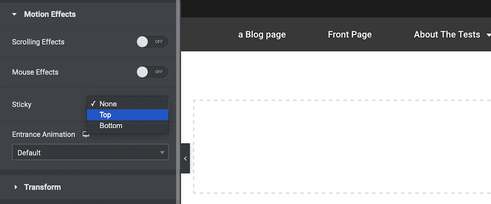
Once you install and activate your plugin, you’ll need to head to wherever the theme options are. For some plugins, this will be within the WordPress Customizer; for others, a dedicated admin panel. Here, you’ll use a custom admin panel at myStickymenu > Dashboard within WordPress:
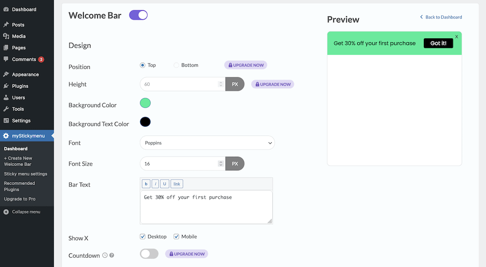
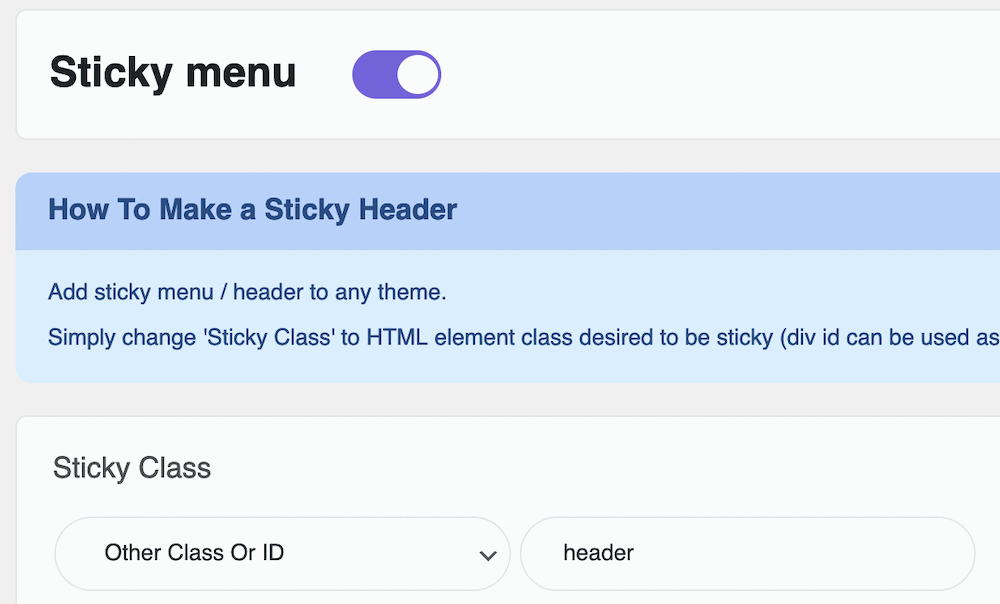
However, the default screen shows the settings for the welcome bar, which for this tutorial, we don’t want. As such, click the toggle button to turn off the bar, and click through to the Sticky menu settings screen:
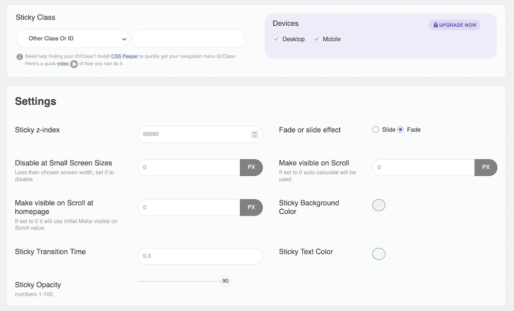
While there are a lot of options here, you only need the Sticky Class panel. Once you toggle the sticky header to “On”, enter the relevant HTML tag for your header in the relevant field that coincides with the Other Class or ID drop-down menu:
Once you save your changes, this will apply to your site. From there, you can look into some of the styling functionalities. For example, you set a fade or slide transition effect, set the z-index, work with opacities, colors, and transition times – along with a whole host of other options.
2b. Write Code to Create Your Sticky Header
It almost goes without saying that this section is for those with development experience. You’ll see later that the code itself is so simple it’s hard to believe. However, given the additional work, maintenance, and general upkeep to create a custom sticky header, you’ll need to draw on other aspects of your experience too.
However, just before you begin, you’ll need the following:
It bears repeating that you do not want to work on your live site’s files. Instead, work within a staging environment or local setup, then upload the files back to your live server after you test things out.
You’ll also want to use a child theme for this, as you are making custom changes to your parent theme. This helps you to organize your code, and make sure that any changes (literally) stick around if the theme receives an update.
Implementing a Sticky Header Using Code: Finding the Correct Header Tags
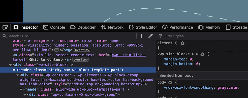
With all this in mind, you can begin. The first job is to discover the right HTML tags for your navigation. The result here will depend on which theme you use, although the header tag is a safe bet for most cases. The best way to find out is to use your browser’s development tools and select the header:
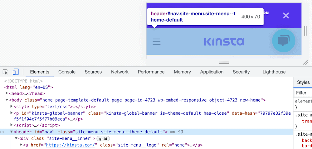
You’ll likely find that it’s not as simple as one tag, so we’d suggest you take a look at your theme’s documentation (or speak with the developer directly) in order to find out the tags you need if you struggle.
Implementing a Sticky Header Using Code: Working With Your Style Sheets
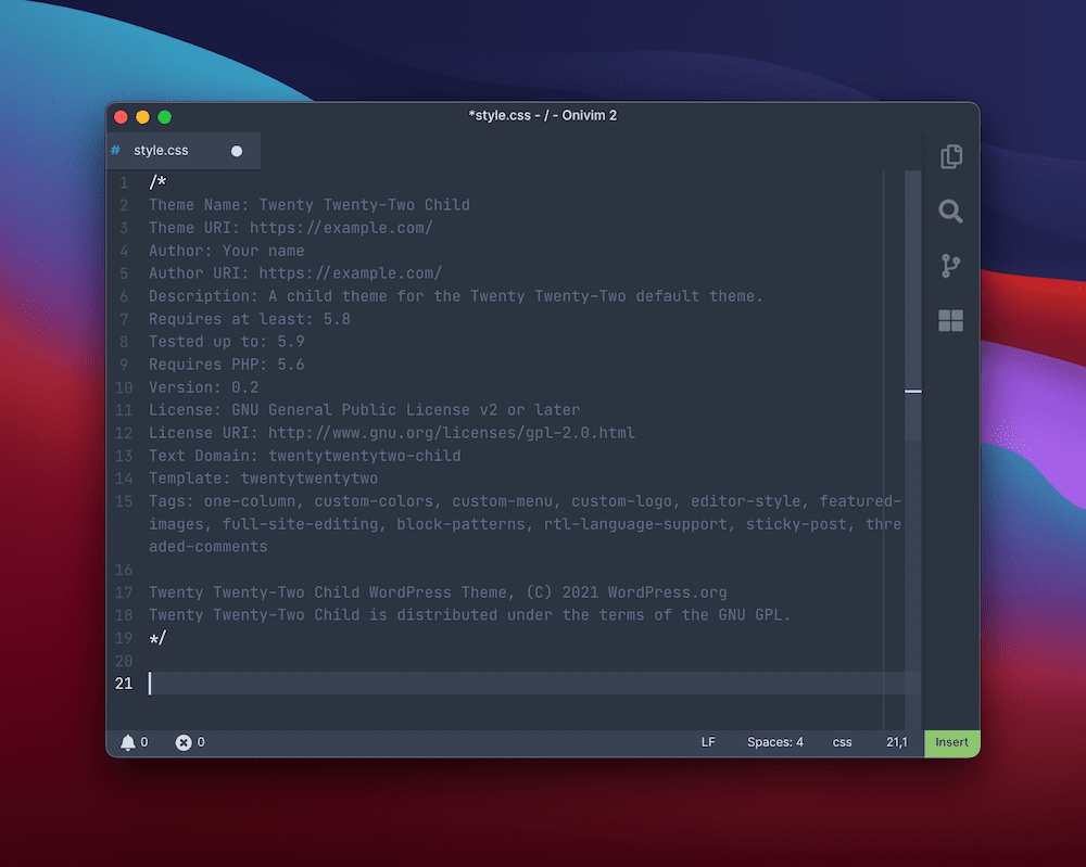
Next, you should create or open a style.css file within the directory for your child theme. This will append your CSS to that of the core installation, and where tags repeat, override it.
Within this file, add the typical metadata you need to register the child theme:
Next, you’ll want to add code to enable your sticky header. This will need some knowledge of CSS inheritance, and depending on the theme you use, could be an infuriating experience.
For example, the Twenty Twenty-Two theme uses two header tags, and it can be difficult to find the right blend of CSS to make your code work on the right element. This is even with the template class dialog within the Block Editor (if you use the FSE functionality):
Regardless, the code you need will be the same:
Akhil Arjun offers a two-line solution for this:
header {
position: sticky; top: 0;
}
However, you might also want to consider using the position: fixed property, which uses a few more lines of code:
header {

    position: fixed;

    z-index: 99;

    right: 0;

    left: 0;

}
This uses z-index to bring the header to the front of the stack, then a fixed attribute to make it stay at the top of the screen.
Note that you may need to add a new class here, in order to apply the sticky header. Either way, this should implement the bones of your sticky header. Once you nail this down, you’ll want to work further on the design to make it work with the rest of your site.
Tips To Make Your Sticky Headers More Effective
Once you have a method to create a sticky header, you’ll want to figure out how you can perfect it. There are lots of ways to improve upon the basic design and make sure that it serves the needs of your site’s visitors.
A good analogy for your own sticky header is to make sure it’s like a good sports referee. Most of the time, you won’t know they are there. However, when a player or coach needs them, they’ll make a call and become present.
Your sticky header should do the same – stay back in the shadows, or out of mind until the user needs it. You can achieve this with a few rules of thumb that (as always) you can choose to break if the design calls for it:
- Keep it compact. Screen space is going to be at a premium, so look to keep the header small. You could implement a solution where your header scales in a dynamic way, based on the area of the site it is featured on.
- Use hidden headers and menus on small screens. By extension, you could choose to hide a menu away, much like the earlier example of Hammerhead. This helps to keep the header compact, and ties in with the next point.
- Make sure you don’t introduce distractions. The greater number of elements on screen, the more they vie for attention. If the sticky header doesn’t need to show an element, remove it – your body content will appreciate it, as will your metrics.
- Offer contrast. This is a trick from the call to action (CTA) playbook. If you use contrast for the sticky header as a whole, and its individual elements, you can draw the eye to where you need it – or push it somewhere else.
On the whole, your sticky header will only do what you need it to, and no more. Sometimes you’ll need to keep things minimal, other times you’ll pack it out with links, logos, and signup forms. Either way, if you keep the UX and UI in mind, you’ll always make a user-focused decision.
Summary
Usability and the UX of your site are so important that they should be the first, second, and third things you nail down when you design and build it. Your site’s navigation is just one aspect of that, but you need to figure out the best way to get a user moving around your site without fuss. A sticky header is a good way to achieve it.
If you pin the header to the top of the screen, the user will always have navigation elements to hand. This is especially helpful on devices that require scrolling to move around body content but offers benefits regardless of the form factor. If you’re a WordPress user, you can either choose a plugin or code to implement a sticky header. However, you might spot the functionality in your favorite theme, in which case, you could use this and take a hit on flexibility.
Do you think a sticky header is an essential UX and UI element of a website, and if not, what is? Let us know in the comments section below!
Save time, costs and maximize site performance with:
- Instant help from WordPress hosting experts, 24/7.
- Cloudflare Enterprise integration.
- Global audience reach with 34 data centers worldwide.
- Optimization with our built-in Application Performance Monitoring.
All of that and much more, in one plan with no long-term contracts, assisted migrations, and a 30-day-money-back-guarantee. Check out our plans or talk to sales to find the plan that’s right for you.