Imagine walking into a retail store to look for some new work clothes. You notice stains on the floor, disorganized shelves, and a strange odor as you look around. Would you stay in the store and buy from the retailer?
Store design influences how customers behave — the same is true of websites.
A survey of 612 people by Clutch found that 83% of participants notice when a website’s design is aesthetically pleasing and up-to-date. Alternatively, 50% of participants would leave a website forever if they believe the content is irrelevant or doesn’t meet their needs.
So, how do you design a website customers will like?
That’s what this article is all about. We’ll show you why good web design is essential and share 15 web design principles you can leverage to build a high-quality website.
Why Is Good Web Design Important?
The average web designer earns $57,000 annually — about $8,000 more than junior web developers who average $44k annually. Designers are compensated reasonably well for a good reason: their work is vital.
When a new lead visits your website, it sets the first impression that shapes their future interactions with your brand. It is at this point that they develop their first opinion about you.
Your website also conveys your brand’s identity, vision, and position within the industry. If you have close competitors with a similar product, a website that makes people say “wow” will make you more memorable and boost your brand awareness above the competition.
Additionally, a strong website can improve your search engine optimization (SEO) efforts.
Search engines consider how people respond to websites when ranking them in search results. If your bounce rate is low and people frequently visit multiple pages on your site, search engines will likely rank you higher than a competitor with a high bounce rate.
Technical SEO is also important here. Websites with well-designed titles, page structures, and links are more accessible. Thus, search engines and customers alike favor them. Let’s take a look at some important web design principles.
15 Principles of Effective Web Design
When we refer to “web design principles,” we refer to general rules for designing the textural and visual elements of a website or web page. Every brand embraces web design principles differently — some in line with best practices and others not.
To help you craft an excellent website, here are 15 web design principles (plus examples of websites that use them effectively):
1. Pages Should Be Easy to Navigate
In Clutch’s study into user experiences on websites, 94% of participants viewed website navigation as the “most important website feature.”
It’s no surprise why. If a search engine user comes to your website looking for information on “mobile design” and can’t find it, the natural next step is to click “back” and try another website.
How do you embrace well-planned navigation? Draw inspiration from The Cool Club’s website.
When you enter the Cool Club’s homepage, the website’s layout is extremely clear. You can navigate to key product sections (like “card games” and “bucket list”) using the buttons on the left-hand side, and you can navigate to the “about” and “contact” pages using the buttons on the right.
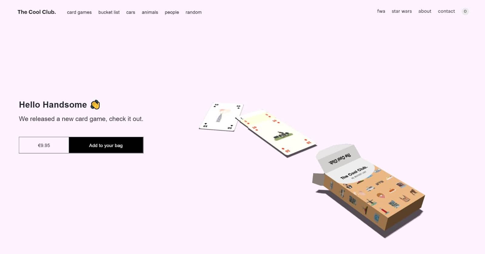
The Cool Club’s product pages are also very easy to navigate. The brand currently has an interactive card deck that features 54 cool variations and corresponding pages. You simply scroll down and click on the card you want to see more of.
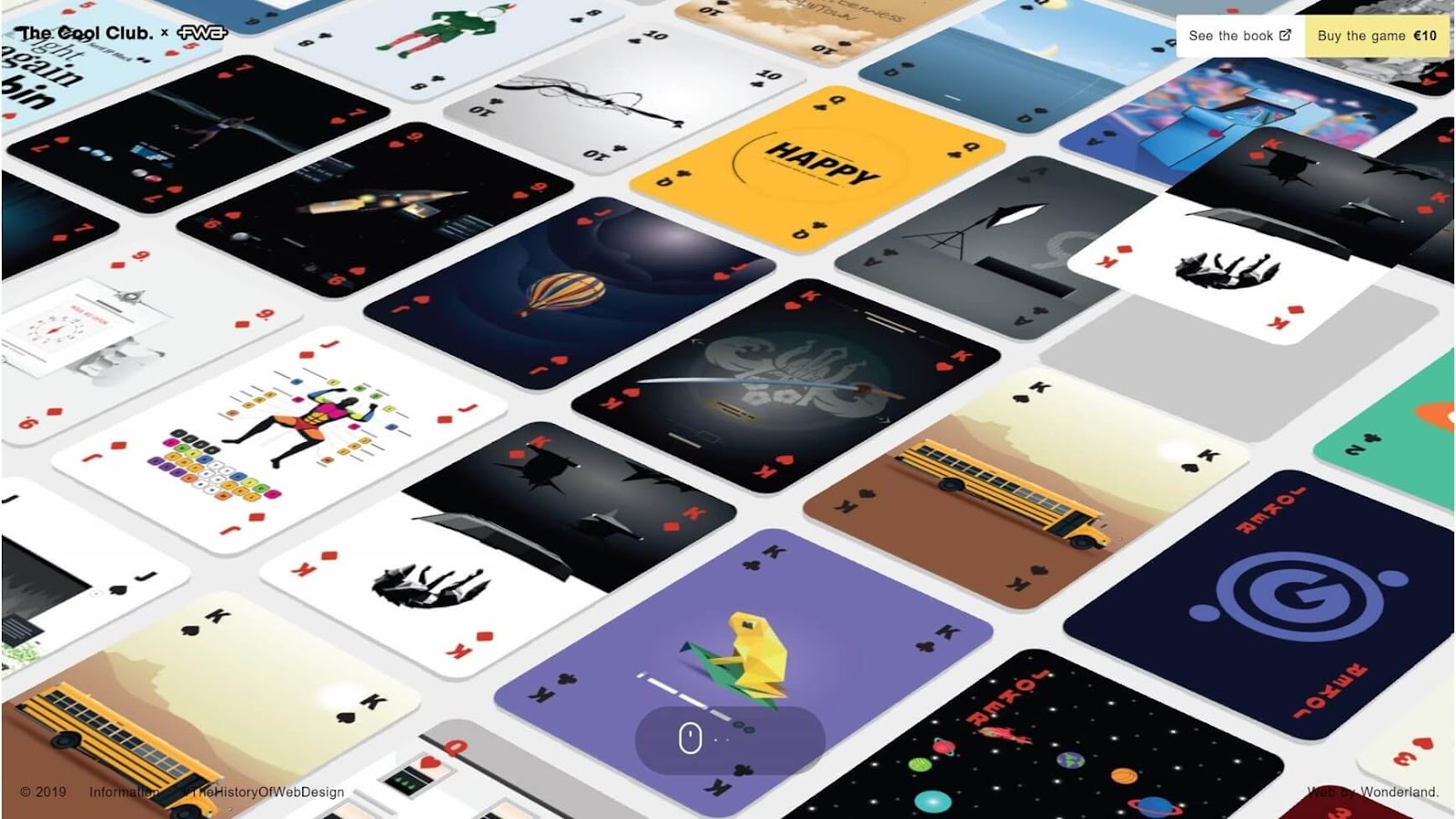
To create a similarly effective website, sort content into clear categories for your headers and footers and give them descriptive titles. Then, order your pages by topic, so people can navigate between similar topics easily.
Additionally, make your header and footer consistent throughout your website.
2. Always Leverage Negative Space
Negative space (or “white space”) is the region around the subjects of a page, whether they be images, videos, text, or buttons.
Many enthusiastic marketers rush to fill every free space on a page, hoping that giving visitors more information will get them more engaged. However, this often results in overwhelming and confusing pages.
That’s where negative space comes in. Using negative space emphasizes the most critical elements of each page, as the lack of color draws the visitor’s eyes to brighter areas.
Of course, “use negative space” doesn’t mean “create a boring white website.” Instead, you can leverage space using your brand colors, just like Garoa does.
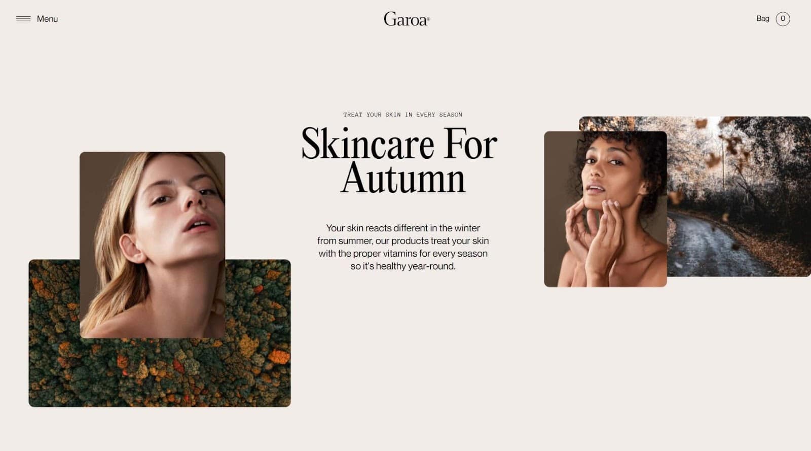
Garoa’s homepage uses a cream-like palette to build ambiance while still leveraging negative space. The result is that your eyes go to the introductory content in the “skincare for autumn” section in the center instead of the less important parts.
Make sure to leverage white space to showcase hierarchy in your own website.
3. Pages Should Be Consistent, But Engaging
When you read brand names like “Cadbury,’ “Hershey’s,” or “Nike,” the vision of their logos, fonts, and design styles likely comes to mind immediately. That’s the power of consistent branding.
When designing your website, craft pages with consistent elements to give your brand a clear visual identity. That means:
- Using the same fonts, styles, and colors across headers
- Keeping spaces between visual elements the same between pages
- Using color palettes instead of random colors
- Setting layout guidelines for long-form content like news pieces and blog posts
- Using a website template for all pages
Consistent pages don’t need to look completely uniform. Instead, you can balance consistency and engagement by mixing up elements.
For example, you can use different fonts and colors for H1, H2, and H3 headings. Or, you can alter the layout of different types of pages, to mix things up.
4. Embrace Complementary Colors
Complementary colors are pairs of colors that you can mix without making your design look overwhelming and ugly.
The way colors display on a screen follow the Red, Green, and Blue (RGB) color model rather than the Cyan, Magenta, Yellow, and Black (CMYK) model used in printing. Painters also often use the Red-Yellow-Blue (RYB) color model that considers complementary colors to be red-green, blue-orange, and yellow-purple.
No matter which model you prefer, using complementary colors achieves a similar purpose to black and white. Complementary colors provide emphasis and create a clear visual identity for your brand.
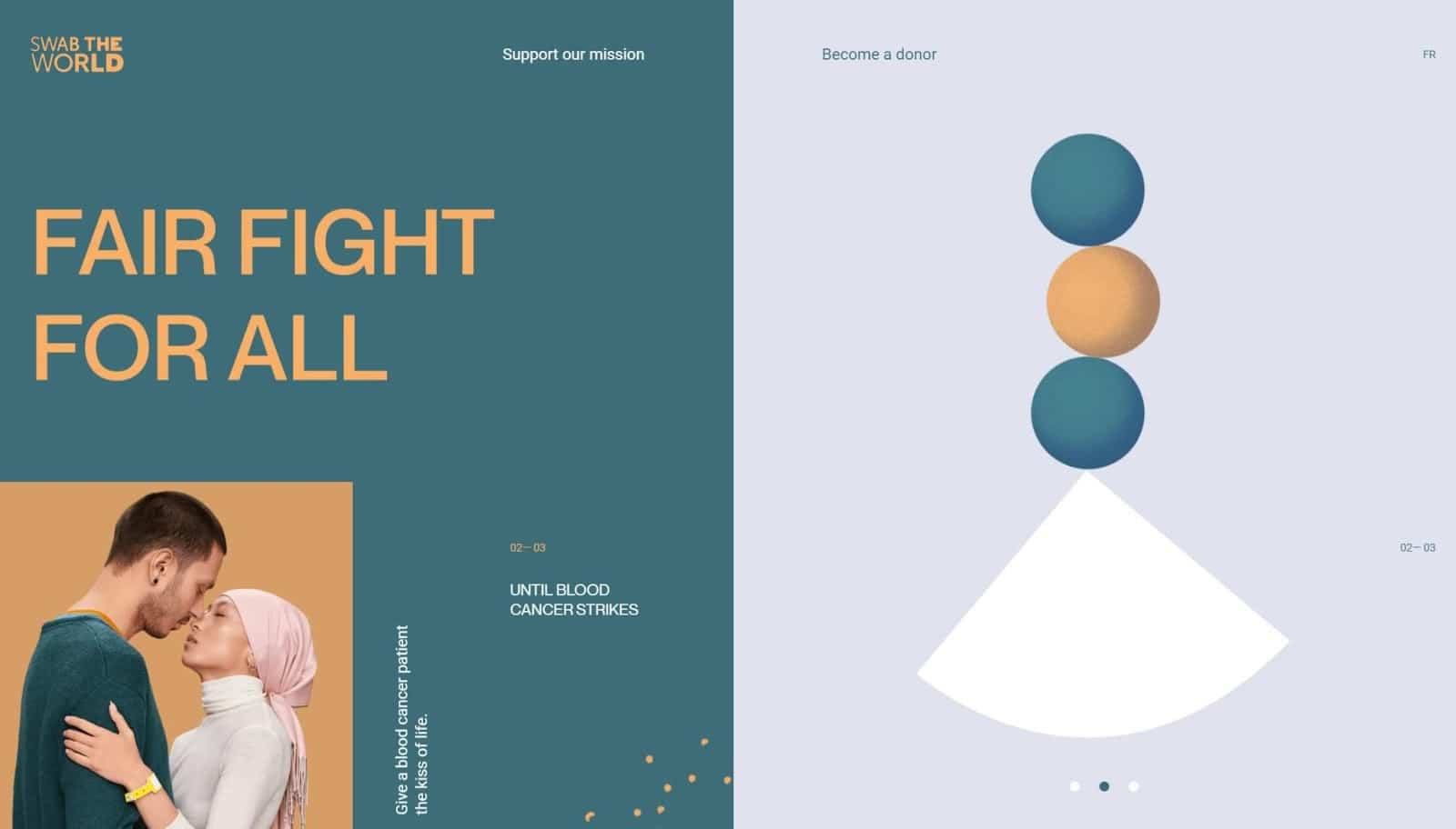
You can see this on Swab The World’s website.
In the screenshot below, the blood cancer charity uses green and shades of magenta. These colors change to other complementary color combinations when you visit different website sections (though all the colors have similar saturation, so the branding remains consistent).
Complementary colors are an easy principle to use in your design. If you want to keep things simple, select two complementary colors and add them to contrasting elements (like an H2 and body text). Or use multiple shades of each color on each page.
5. Design With Your Target Audience in Mind
If you look at The Cool Kids, Garoa, and Swab The World’s websites, you may notice that each website has a unique “feel.” That feel comes from tailoring the design of the website to the audience.
Personalization is the ultimate goal here. Most of us like to buy products and services from brands we feel aligned with and represented by. In fact, research shows that 72% of consumers value purchasing from companies that “align with their beliefs and values.” So, if someone visits your website and sees their values, goals, and priorities reflected there, they are more likely to purchase from you.
To personalize your website design to your audience, consider:
- What images resonate with your target market, specifically
- What tone works for your audience (for example, professional, minimalistic, bubbly, etc.)
- What topics your target market comes to your website to see
- How you can convey your brand positioning through your web design
- What calls-to-action (CTAs) your audience responds to (and where you should put them to optimize your click-through rate (CTR))
Bonus points if you can use website automations to deliver a personal experience based on the user’s profile and previous interactions with your brand.
It might be helpful to draw inspiration from competitors or brands that sell different things to your target demographic.
6. Fonts Should Be Readable And Accessible
The fonts you use on your website determine whether your visitors can read what you wrote or not. Safe to say, they are very important.
The first thing to consider when selecting a font is web safety. Web-safe fonts are supported by operating systems and web browsers, so they’ll work on most devices.
You also need to consider accessibility. Accessible fonts should be clear and easy to read at large and small sizes. For example, cursive-based fonts aren’t very accessible, while Times New Roman is fairly accessible.
Additionally, watch for trends of fonts on other websites when selecting a font. In 2021, data scientist Michael Li analyzed the fonts on over 1,000 websites. He found the following trends:
- 85% of fonts don’t use serifs (the little added lines to letters in newspaper type)
- The top five fonts include Sans Serif, Arial, Helvetica, Helvetica Neue, and Roboto
- H1 headers have a 58% probability of having no serifs (compared to 93% for paragraph text)
- The two most common sizes for paragraph fonts are 14 px and 16 px
You might choose to embrace this information to select a font style that adheres to what people look for in websites. Or, you might choose to do something different.
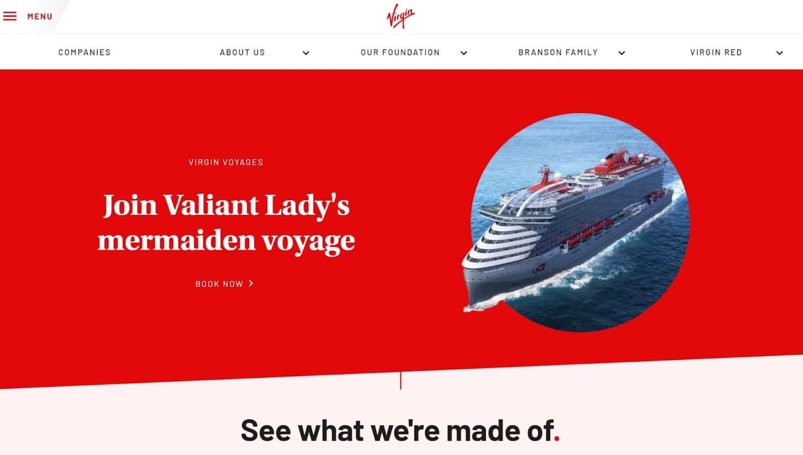
Virgin is a brand that chose the second option. Virgin used at least five fonts in the screenshot below. These fonts separate sections of the page and make them look engaging.
7. Follow Fitt’s Law and Hick’s Law
Psychologist Paul Fitts first developed Fitt’s Law in 1954, but it’s still highly relevant in web design in 2022. Fitt’s Law argues that the size of a target influences how much time it takes someone to reach it.
In a web design or User Experience (UX) context, this means that it’ll take people less time to click larger buttons or more time to click smaller buttons. So, to leverage Fitt’s Law, you should make your CTA buttons extremely large and prominent so that they are easier to click.
“Easy” is crucial here. Hick’s Law, developed by British psychologist William Edmund Hick and American psychologist Ray Hyman, says that people become fatigued every time they decide something.
So, the more decisions you ask a website visitor to make, the greater the chances they’ll become too fatigued to follow through.
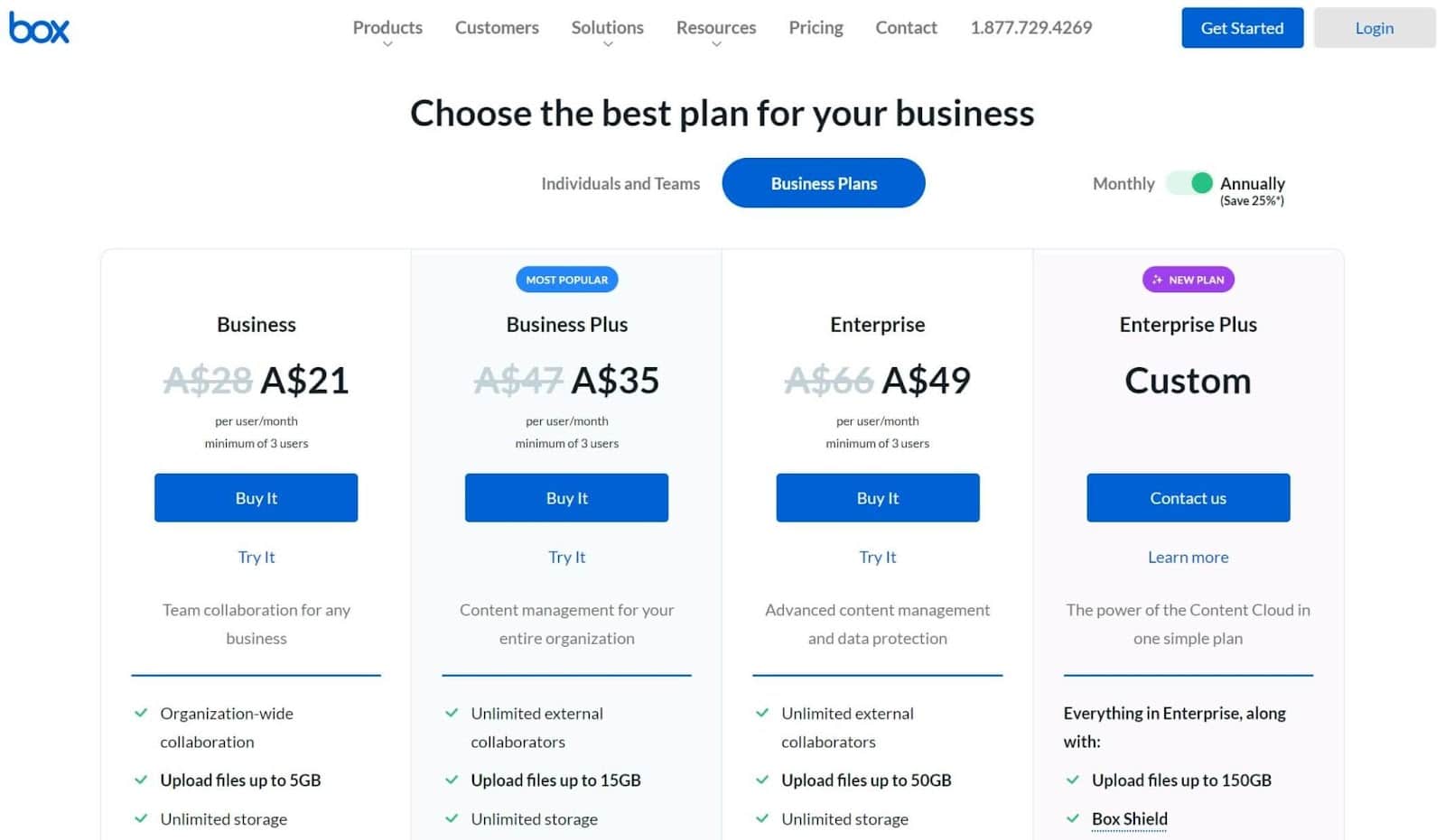
8. Use Invariance To Highlight Key Information
When something’s “invariant,” it stands out as a unique option from several very similar options. The most obvious example of invariance is the highlighting in plans on pricing pages like this one from Box.
But that’s not the only way you can use invariance. Invariance can help you establish a visual hierarchy on your pages to highlight key information and draw people to important parts of your page.
For example, take a look at how the Frans Hals Museum used invariance to create a visual hierarchy on its homepage:
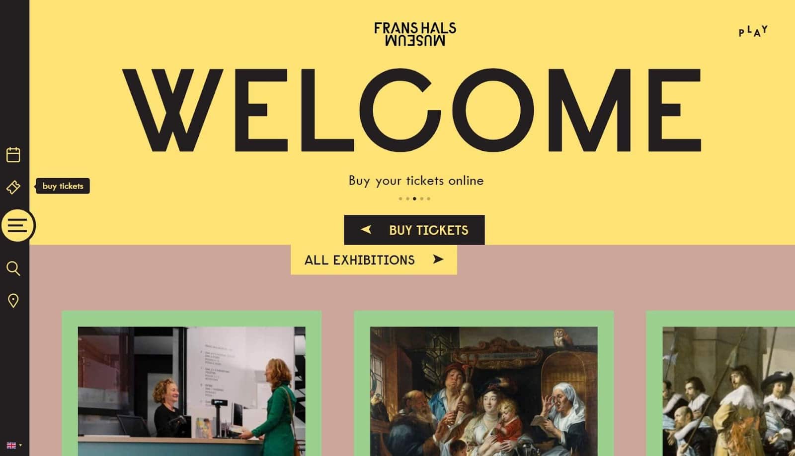
The hierarchy in this image is as follows: the “welcome” sign, the images, the “buy tickets” sign, the “all exhibitions” sign, then the other content.
To use invariance to create your own hierarchy, rank page elements in order of importance. Then, adjust each element’s size, color, and placement until visitors’ eyes go to each element in the order you want.
9. In CTAs: Use Clear Language People Will Want To Click
We touched on the importance of making your buttons large and easy to click, but size isn’t the only thing you should consider when creating buttons.
Clickable buttons are descriptive and persuasive at the same time. They make the visitor curious about what the button links to, and they give them a reason to go there.
One way to do this is to use detailed button text like “click here to read our blog,” “find our marketing secrets here,” or “here’s our 2022 report.” Another is to make your buttons visually exciting or unique.
Rainforest Protector took both approaches. Rainforest Protector allows you to navigate the Amazon rainforest by visiting different locations. Each location’s button includes an image and an action like “visit the village.”
10. Leverage The F Pattern Or The Z Pattern
Over 13 years, researchers from the Nielsen Norman Group (NN Group) used eye-tracking to see how 500+ people engage with content. This led them to develop the F pattern, which says the first thing people do is scan down the page, then they read in left-to-right lines. Like this:
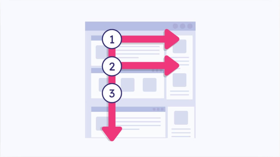
You can leverage the F pattern on your website by structuring your content around it or an alternative model.
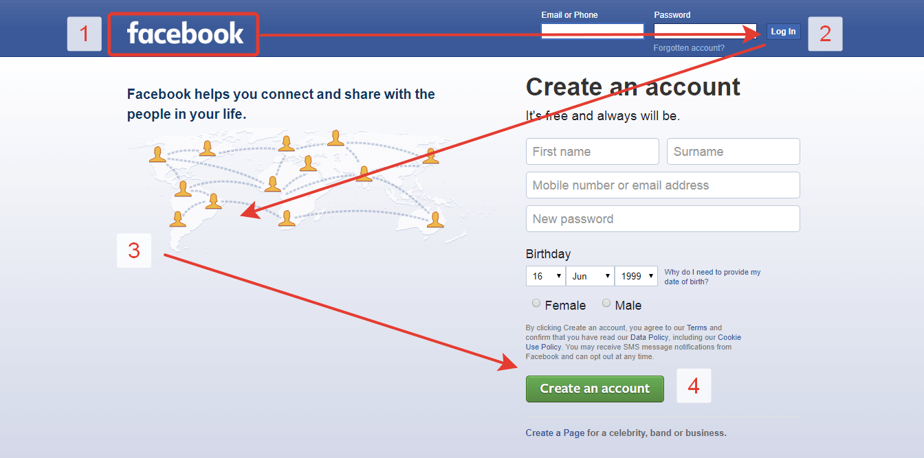
Facebook famously uses a Z-shaped pattern on its homepage. When you visit the page, your eyes go to the “Facebook” logo, then the “login” button, then to the image on the left, and finally to the “create an account” button.
11. Good Websites are Fast and Mobile-Friendly
As of the fourth quarter of 2021, 54.4% of website traffic globally came from a mobile device. So, if your website isn’t mobile-friendly, you could halve your traffic.
Speed also influences organic website traffic. Research from Google shows that 53% of people leave a website if it loads in more than three seconds.
The easiest way to make your website mobile-friendly or fast is to choose a fast website theme made by expert designers. Or, if you want to be more involved in your website’s design, you can custom-build a responsive website.
That’s what the designers behind the 1917 movie did. 1917‘s website delivers an immersive experience to get people invested in the movie. It’s specifically designed for mobile devices, as you can use your finger to move around in the trenches of World War One.
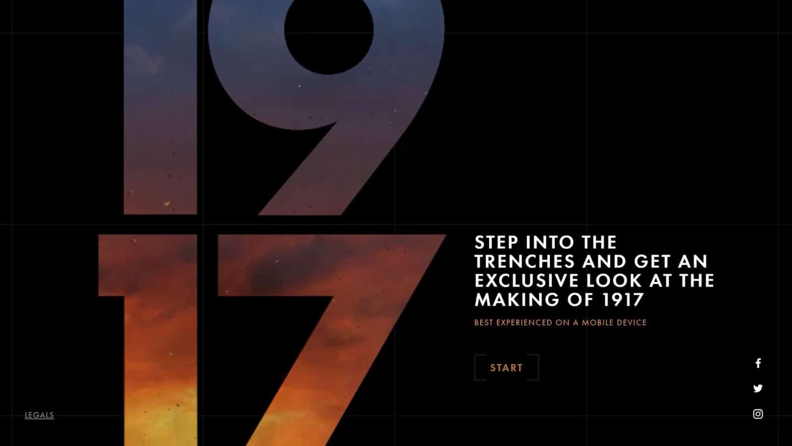
If you’re observant, you’ll notice that 1917’s website also leverages the F pattern.
12. Break Text Into Bite-Sized Chunks
Consider this: you search for “mind games” and find a webpage that seems promising. However, when you click on it, you’re overwhelmed with large chunks of text that are difficult to read.
Like many people, you may click off the website (no matter how promising the content!).
Eye-tracking research from the Missouri University of Science and Technology shows that website visitors spend an average of 5.59 seconds reading text. So, if people can’t consume your text in that timespan, it’s unlikely you’ll engage them properly.
Fix this issue by dividing your text into small chunks. Additionally:
- Use short sentences
- Stay away from colloquialisms
- Provide definitions for any industry-specific words you use
- Avoid ‘purple prose’ (unnecessary metaphors, adverbs, and adjectives)
13. Use Grids
When we say “use grids,” we don’t mean that you should make your website look like an Excel table. Instead, divide your website into distinct sections that serve a specific purpose so visitors can quickly locate content.
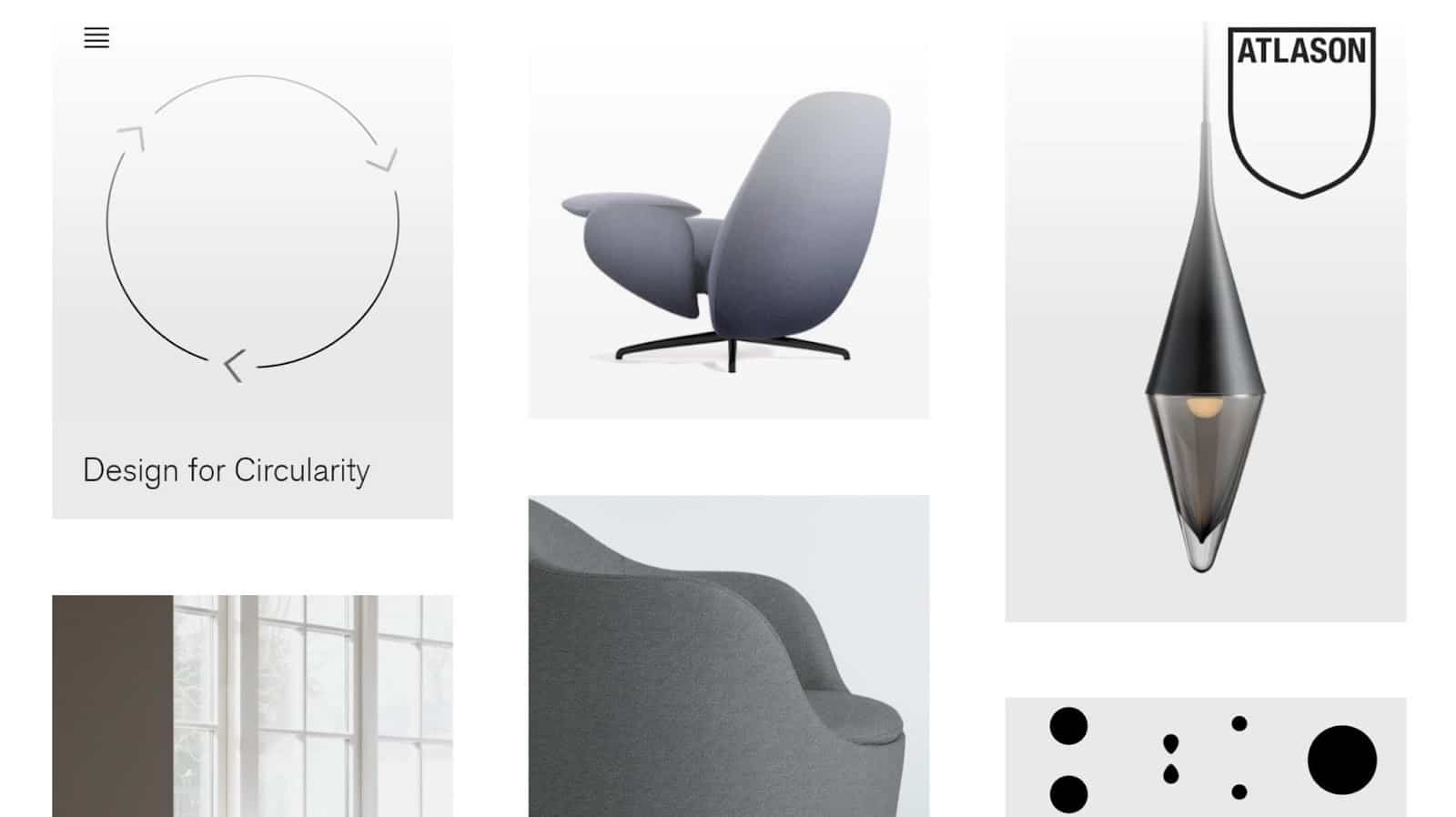
You don’t need to use grid lines to do this. Instead, create distinctions between grid spaces with color, negative space, and shading like Atlason did. Atlason’s homepage features new and best-selling products in grids. As visitors are likely looking for these products, the grids help them find them in seconds.
One of the easiest ways to use grids on your website is to select a WordPress theme that uses them. Examples include Gridframe, Masonry Grid, and Shuttle Grid.
14. Remember Balance
In the context of web design, “balance” refers to the way design elements sit in relation to each other and whether the elements portray harmony. There are many ways to create balance on your website, including some of these web design principles:
- Through symmetry (including bilateral, radial, or translational symmetry)
- Using complementary or contrasting colors
- Using elements of similar shapes and sizes
- Using repetitive patterns
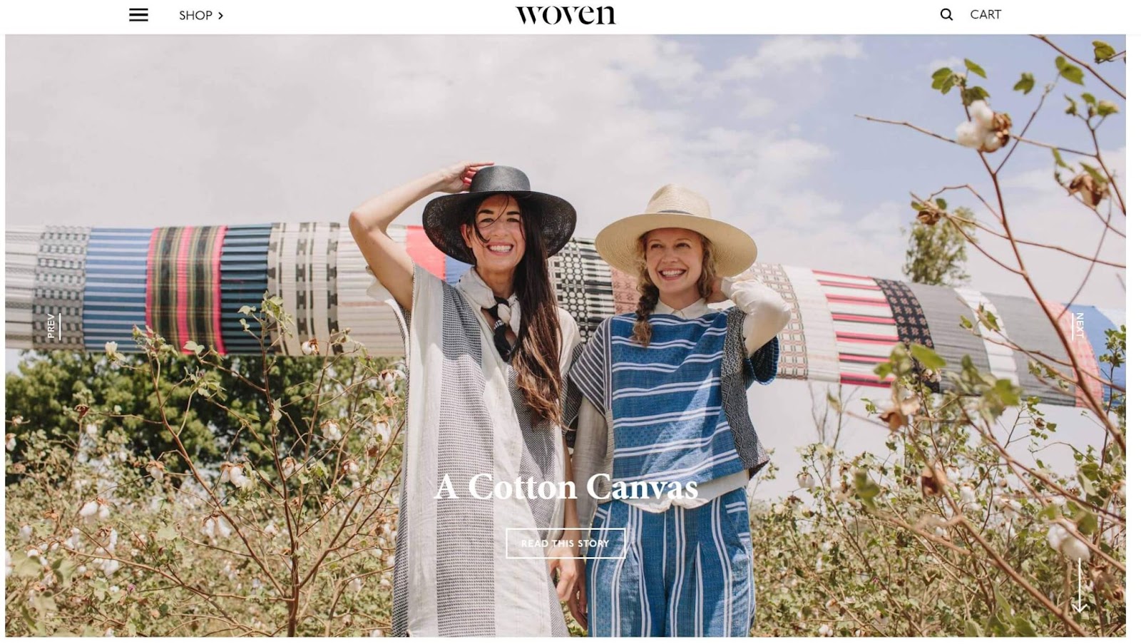
You can see balance in action on Woven’s website. This website uses a balanced color palette, black and white to create contrast within the text, and symmetry to draw visitors’ attention to the content.
15. Pay Attention To Details
Gestalt theory says that people perceive something as a whole before looking at individual elements. Or, like Kurt Koffka said: “The whole exists independently from the parts.” Though people usually reference Gestalt theory regarding psychology, it applies to web design too.
You need to pay attention to the small details on your website to ensure your design looks polished and complete. When designing something, it’s easy to focus on important elements like headings, images, and CTAs and forget other things like:
- Footer and header icons
- Social media buttons
- How effectively you converted your website to WordPress (if applicable)
- Text spacing
- Typos and grammar errors
- Browser compatibility
- Image sizes
Double-check these elements before hitting “publish” and ensure your website conveys professionalism. You may overlook minor flaws, but visitors won’t.
Additionally, keep up-to-date with new trends and concepts in web design principles. Adding these to your website will keep it looking new, fresh, and engaging.
Summary
A well-designed retail store enhances the customer experience, while a poor one could forever put customers off your brand. It’s the same with web design.
Building a visually-appealing website is more than just a fun project. It can help you:
- Convey professionalism
- Build trust with your visitors
- Stand out from your competitors
- Draw in organic traffic from search engines
Leverage the web design principles in this article to build a website that makes visitors say “wow.”
Now that we’ve covered everything we know about web design, we’d love to hear from you. What do you notice when you visit a brand’s website? Additionally, do you use any principles we haven’t mentioned on your website? Please tell us in the comments below.
Save time, costs and maximize site performance with:
- Instant help from WordPress hosting experts, 24/7.
- Cloudflare Enterprise integration.
- Global audience reach with 32 data centers worldwide.
- Optimization with our built-in Application Performance Monitoring.
All of that and much more, in one plan with no long-term contracts, assisted migrations, and a 30-day-money-back-guarantee. Check out our plans or talk to sales to find the plan that’s right for you.